

Customizing Components (V2 Preview)
The Customizing Components guide with the Components V2 additions. Shared privately with early-adopter partners.
This is the early-adopter copy of the Customizing Components guide, extended with the V2 options. It is shared privately; the additions merge into the public page when Components V2 is generally available.
Components are powerful tools to build your payroll product and get to market faster, without having to reinvent the wheel of tried and true payroll user interfaces. However, since your brand is important to you and your customers, Check offers the ability to customize Components so that you can have all the benefits of quick iteration, without having to sacrifice on user experience.
Various parts of all Check Components can be customized to closely fit your product’s brand, including the logo used throughout, fonts, and colors. To customize a Component, you can pass appearance settings to the Check Component and Onboard SDKs. For example, to set a component’s primary color, the font family used for standard text, as well as the font family used for monospace text (e.g. in number inputs), and whether the component shows the close button, you can specify the following:
const handler = window.CheckComponent.create({
  link: componentLink,
  appearance: {
    fontFamily: 'Public Sans',
    monospaceFontFamily: 'Courier New, monospace',
    primaryColor: '#00008B',
    includeCloseButton: false,
    height: "100%",
    width: "100%",
    includeLogo: true,
  },
  onEvent: (event, data) => {
    // handle Check Component events
  },
});
If you are not using the Component or Onboard SDK, you can pass the same appearance settings as query params to the generated component links:
https://onboard.checkhq.com/start/?code=...&primary_color=%2300008B&font_family=Public%20Sans&monospace_font_family=Courier%20New%2C%20monospace&include_close_button=falseBoth of the above examples will render the following:
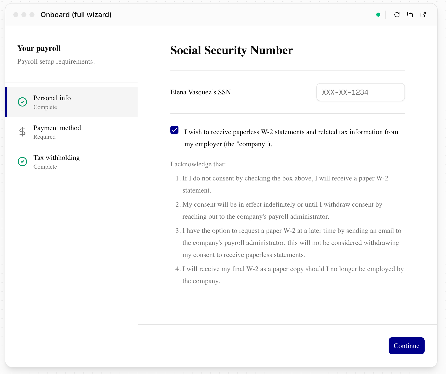
Components V2
The new generation of Check Components uses the same customization mechanism: pass appearance settings through the SDK, or append the equivalent query parameters to the component link. Everything documented above carries over unchanged, and V2 adds two options:
| Setting | SDK key | URL parameter | Values |
|---|---|---|---|
| Corner rounding | borderRadius | border_radius | CSS length, e.g. 8px |
| Color scheme | colorScheme | color_scheme | light (default), dark, system |
system follows the user's OS preference live. If your application has its own light/dark toggle, the SDK handler can switch the component in place without a remount:
handler.setColorScheme('dark'); // 'light' | 'dark' | 'system'Setting appearance on a minted link
Appearance settings ride the component link itself, so the full flow is: mint the link with your API call, then attach appearance either through the SDK or directly on the URL.
curl -X POST https://api.checkhq.com/companies/{company_id}/components/payment_setup \
  -H "Authorization: Bearer {api_key}"
Then either open the returned URL through the SDK with an appearance object as shown above, or append the parameters directly:
{returned_component_link}&primary_color=00008B&font_family=Public%20Sans&color_scheme=systemThe fastest way to dial in your settings is the Component Explorer, which previews any component with live theme controls and can copy the resulting parameters for use in your requests.
Check Components support all web-safe fonts out of the box. Any appearance settings passed to the components programmatically can also be set as defaults across all components on your provider configuration, without needing request-time definition; reach out to Check to set those up.
Custom fonts
To use a font that is not web-safe, your provider configuration carries a custom font source: an HTTPS URL to a CSS file containing the @font-face rules for your font. Components load that stylesheet automatically, so the fontFamily you pass (or font_family on the link) resolves to your brand font. A separate monospace source covers the monospace family if you customize that too.
Three ways to supply the source, in order of how often partners use them:
- Google Fonts. Send us the CSS URL from the "Get embed code" panel, for example
https://fonts.googleapis.com/css2?family=Public+Sans:wght@400;500;600&display=swap. Include the weights 400 through 600; the components use them. - Your own hosting. Any HTTPS URL to a CSS file with
@font-facerules works, including Adobe Fonts (Typekit) project URLs. If you host the font files yourself, they must be served with CORS headers (Access-Control-Allow-Origin) since the components load them from a Check domain. - Check-hosted. If your font's license allows it and you would rather not host, send us the font files (woff2 preferred) and we will host them on Check's assets CDN and configure the source for you.
Two things that will not work: a link to a font's page (for example a Google Fonts specimen page) rather than its CSS URL, and a URL pointing directly at a font file (.otf, .woff2) rather than a CSS file that declares it.
Once the source is set, pass the family name with a fallback stack, for example fontFamily: 'Public Sans, sans-serif'. Font sources are configured by Check, so send your URL or files to your Check contact and we will have it live shortly after.
Updated 3 days ago