

Customizing Components
Check Components can be customized to closely fit your product’s brand, including the logo used throughout, fonts, and colors. Appearance settings are applied when a component is opened, not when its link is created. The request that generates a component link takes no appearance settings, and the link it returns is the same with or without them.
Pass appearance settings through the SDK's appearance object when you open the link. This is the recommended path. For example, to set a component’s primary color, the font family used for standard text, the font family used for monospace text (for example, in number inputs), and whether the component shows the close button:
const handler = window.CheckComponent.create({
  link: componentLink,
  appearance: {
    fontFamily: 'Georgia, serif',
    monospaceFontFamily: 'Courier New, monospace',
    primaryColor: '#00008B',
    includeCloseButton: false,
  },
  onEvent: (event, data) => {
    // handle Check Component events
  },
});
If you embed without the SDK, append the same settings to the link the API returned, as query parameters. This is the only path for a hand-built iframe.
{returned_component_link}&primary_color=%2300008B&font_family=Georgia%2C%20serif&monospace_font_family=Courier%20New%2C%20monospace&include_close_button=falseBoth examples render the Onboard flow like this:
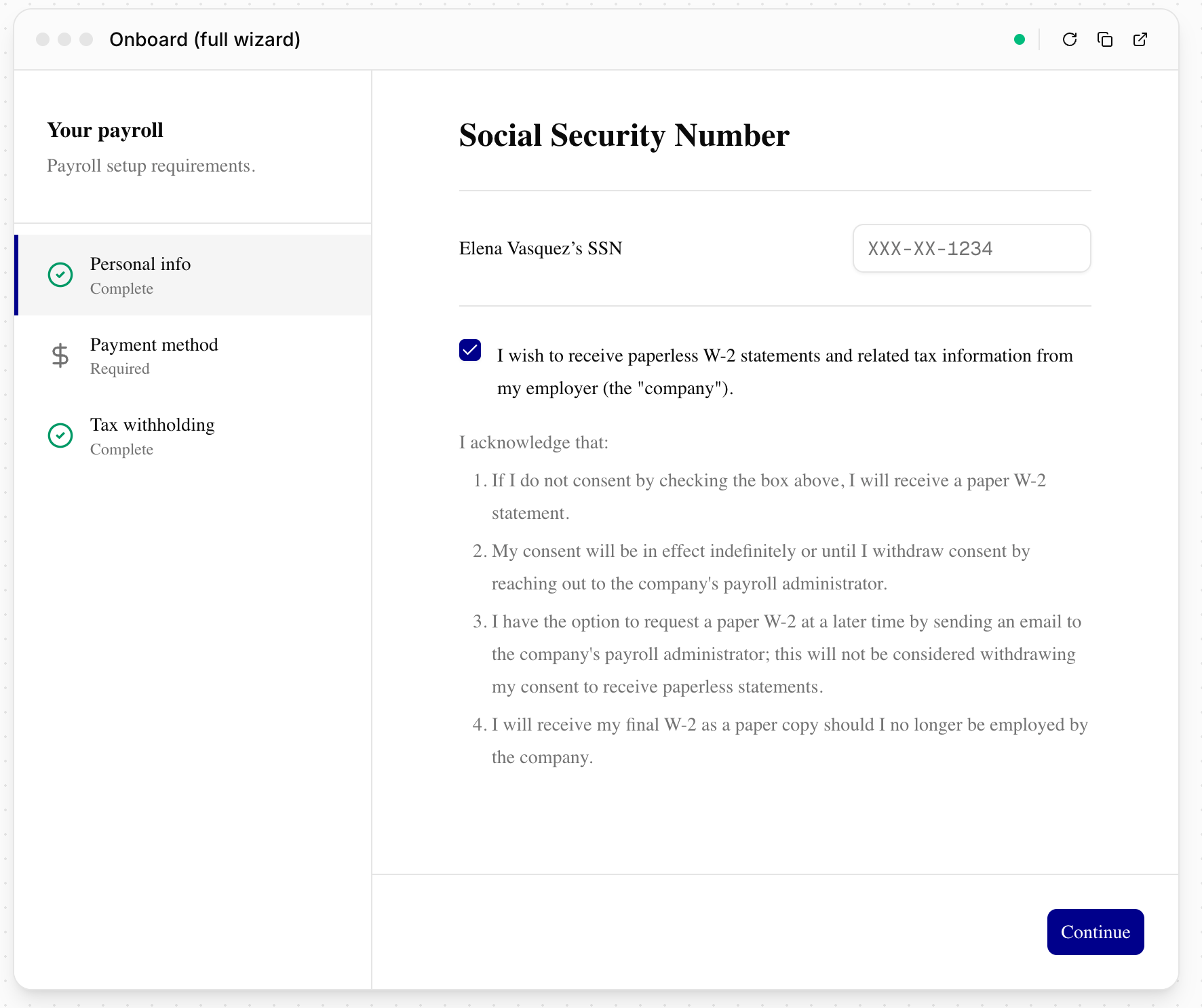
Appearance settings
Every setting is available as a key on the SDK's appearance object and as a query parameter on the component link. A link parameter overrides the default configured on your provider account for that link only.
| Setting | SDK key | URL parameter | Values | Default |
|---|---|---|---|---|
| Primary color | primaryColor | primary_color | Hex color. Percent-encode the # as %23 in a URL. | Your provider theme |
| Accent color | accentColor | accent_color | Hex color, same encoding. Links and the focus ring, independent of the buttons. | Primary color |
| Font | fontFamily | font_family | Font stack string | Inter |
| Monospace font | monospaceFontFamily | monospace_font_family | Font stack string | Geist Mono |
| Corner rounding | borderRadius | border_radius | Length in px, rem, or em, e.g. 8px | 0.625rem |
| Input corners | borderRadiusInput | border_radius_input | Same units. Overrides corner rounding for form fields only. | 80% of corner rounding |
| Button corners | borderRadiusButton | border_radius_button | Same units. Overrides corner rounding for buttons only; small buttons cap it at 10px. | 80% of corner rounding |
| Density | spacing | spacing | Length in px, rem, or em, e.g. 0.25rem | 0.25rem |
| Logo | includeLogo | include_logo | true, false | true |
| Close button | includeCloseButton | include_close_button | true, false. Shown in the Onboard flow when it is embedded through the SDK. | true |
There is no size setting. The component fills the element you embed it in, so size that element instead.
Numeral style (tabular or proportional digits) has no setting of its own. Set it through the token map as font-variant-numeric, described in Theming with a token map.
spacing multiplies Check's whole spacing scale. See Spacing scales everything at once before you set it.
Link text takes the accent color only when it reads at 3:1 or better on the background. Otherwise links use the text color and only the focus ring changes.
Theming with a token map
The named settings cover the brand basics. To set the rest of the palette, pass a token map: themeTokens on the SDK, or theme_tokens on the link as name:value pairs separated by ;.
const handler = window.CheckComponent.create({
  link: componentLink,
  appearance: {
    primaryColor: '#00008B',
    themeTokens: {
      background: '#fafafa',
      foreground: '#111111',
      card: '#ffffff',
      border: '#e5e5e5',
    },
  },
});{returned_component_link}&theme_tokens=background%3A%23fafafa%3Bforeground%3A%23111111%3Bcard%3A%23ffffff%3Bborder%3A%23e5e5e5Accepted token names:
| Group | Tokens |
|---|---|
| Page and surfaces | background, foreground, card, card-foreground, popover, popover-foreground, muted, muted-foreground, accent, accent-foreground |
| Interactive | primary, primary-foreground, secondary, secondary-foreground, destructive, link, ring, border, input |
| Shape and type | radius, radius-input, radius-button, spacing, font-sans, font-variant-numeric |
| Disabled fields | input-disabled, input-disabled-foreground, input-disabled-opacity |
How the app applies a map:
- Named settings win.
primaryColoroverrides aprimarytoken,borderRadiusoverridesradius, and so on. - Setting any color requires
backgroundandforegroundwith a contrast ratio of at least 4.5:1. Without that pair, every color in the map is dropped. - Page text (
muted-foreground,link,destructive) must reach 4.5:1 onbackground. A surface and its foreground, when both are set, must reach 3:1. A token that fails is dropped and the default renders in its place. The Component Explorer lists what was dropped. - Color values must be hex,
rgb(), oroklch()so the guard can read them. Other syntaxes, such ashsl()or named colors, are dropped, and so are translucent colors.border,input, andringcarry no text, skip the guard, and accept any color syntax. input-disabled,input-disabled-foreground, andinput-disabled-opacityset the fill, text color, and opacity of a disabled field, such as a field locked withfield_permissions. By default, a disabled field has a light gray fill, its normal text color, and0.5opacity. Setinput-disabledtotransparentto remove the fill. Opacity takes a number from0to1or a percentage, and doesn't need thebackgroundandforegroundpair. For an example, see Locking company fields.font-variant-numericsets the numeral style for every figure. The default istabular-nums;proportional-numsand the other CSS keywords are accepted.- Unknown names are ignored. Values are capped at 256 characters and cannot contain
url()or;.
The Explorer's CSS editor authors a map for you: paste the custom properties from your design system and copy the result as theme_tokens or themeTokens.
What you can and cannot change
Appearance settings drive Check's own design tokens: colors, corner rounding,
spacing, and fonts. They do not change the structure of a component. Use this
section to check whether a change is possible before you plan around it.
Colors that are fixed
Status colors are not themable. Warning and information banners, success ticks,
and integration status chips use a fixed palette so that the same state reads
the same way in every partner's embed. primaryColor, accentColor, and the
token map do not affect them.
If a status color clashes badly with your brand, contact Check rather than
working around it in your own stylesheet. Component styles are inside an iframe,
so your CSS cannot reach them.
Structure that is fixed
The following are part of a component's layout rather than its theme, so no
appearance setting changes them:
| You may want | Components do |
|---|---|
| Labels that float inside the field on focus | Labels sit above the field |
| Banners with a colored left edge | Banners use a filled background |
| A specific control height | Heights come from Check's own size scale |
| Your own icon set | Icons are Check's set |
Tab and button styles are set per screen and are not configurable.
Spacing scales everything at once
spacing is a multiplier on Check's whole spacing scale, not a single gap. One
value drives every padding, gap, and control height together, so raising it to
reach a particular input height also enlarges every margin on the screen. Set it
to adjust overall density, and leave it unset if you want Check's defaults.
Percent-encode the
#in a hex color when you pass it as a URL parameter:
primary_color=%23000000. A value without it is rejected, and the component
renders with Check's default theme rather than yours.
The full flow
-
Generate the component link with a server-side request. Appearance settings are not part of this request. The body carries only what the component needs; company components that act for a signer take the signer fields shown, and each component's reference page lists its body.
curl -X POST https://api.checkhq.com/companies/{company_id}/components/payment_setup \ -H "Authorization: Bearer {api_key}" \ -H "Content-Type: application/json" \ -d '{"signer_name": "Jane Doe", "signer_title": "Owner", "email": "[email protected]"}' -
Open the returned link through the SDK with your
appearanceobject, as in the first example on this page. Without the SDK, append the parameters to the returned link instead.
Check Components support all web-safe fonts out of the box. Primary color, font family, monospace font family, and custom font sources can also be set as defaults on your provider configuration, so you don't have to pass them on every link; contact Check to set those up. The other settings are per link.
Component Explorer
The Component Explorer previews any component against your sandbox data with live theme controls, and copies the result as link parameters or as an SDK appearance object to paste into your integration.
- In Console, open the Developers page.
- Set the environment switcher to Sandbox.
- Click Component Explorer.
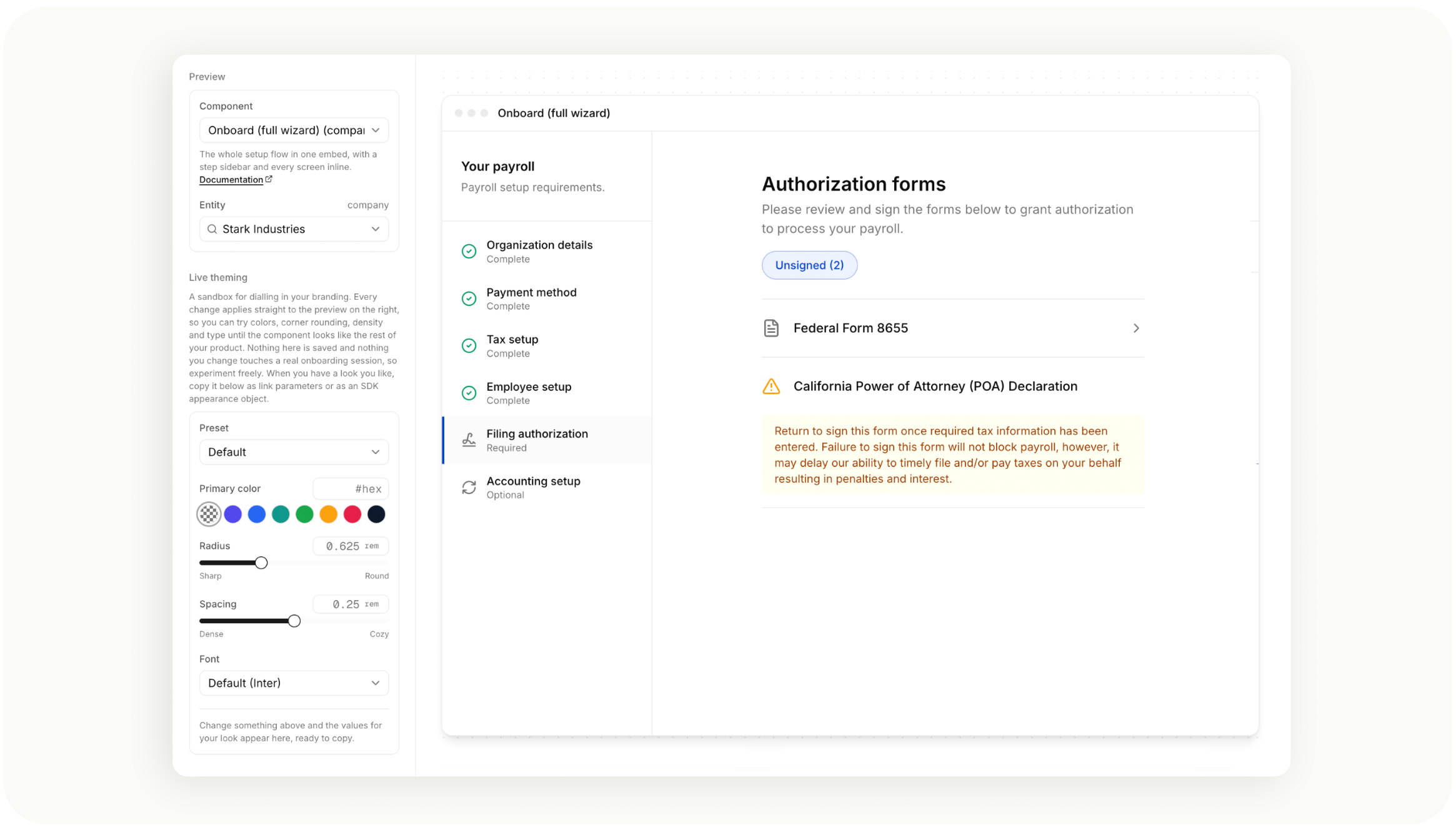
Each component in the picker links to its reference page.
Custom fonts
To use a font that is not web-safe, your provider configuration carries a custom font source: an HTTPS URL to a CSS file containing the @font-face rules for your font. Components load that stylesheet automatically, so the fontFamily you pass (or font_family on the link) resolves to your brand font. A separate monospace source covers the monospace family if you customize that too.
Three ways to supply the source, in order of how often partners use them:
- Google Fonts. Send us the CSS URL from the "Get embed code" panel, for example
https://fonts.googleapis.com/css2?family=Public+Sans:wght@400;500;600;700&display=swap. Include the weights 400 through 700; the components use them. - Your own hosting. Any HTTPS URL to a CSS file with
@font-facerules works, including Adobe Fonts (Typekit) project URLs. If you host the font files yourself, they must be served with CORS headers (Access-Control-Allow-Origin) since the components load them from a Check domain. - Check-hosted. If your font's license allows it and you would rather not host, send us the font files (woff2 preferred) and we will host them on Check's assets CDN and configure the source for you.
Two things that will not work: a link to a font's page (for example a Google Fonts specimen page) rather than its CSS URL, and a URL pointing directly at a font file (.otf, .woff2) rather than a CSS file that declares it.
Once the source is set, pass the family name with a fallback stack, for example fontFamily: 'Public Sans, sans-serif'. Font sources are configured by Check, so send your URL or files to your Check contact and we will have it live shortly after.
Updated 9 days ago