

Components V2: Migration Guide
Move your integration to the new Check Components app ahead of the September 1 general availability date.
Components V2 goes live for all providers on September 1. There is nothing you need to build, and nothing changes for your integration until your cutover. Use this guide to verify your flows in sandbox and dial in your theme ahead of the switch.
Check Components V2 is a ground-up rebuild of every embedded component, plus the full Onboard flow, on a new stack with a consistent design system. Every surface you can reach today has a V2 equivalent with matching behavior, and the SDK events your integration listens for are unchanged.
What migration means for you
Almost nothing, by design. The switch is server-side: when we enable V2 for your account, the links Check mints start pointing at components.checkhq.com instead of onboard.checkhq.com. Your integration keeps doing exactly what it does today.
You do not need to change:
- API calls.
POST /{entities}/{id}/components/{component}andPOST /{entities}/{id}/onboardkeep the same paths, request bodies, and responses. The returned URL just points at the new app. - The SDK. The same embed snippet works against both generations. Do not hardcode either host; always open the URL the API returns.
- Event handling. All
check-component-*andcheck-onboard-*events fire with the same names, payloads, and triggers. If you branch oncheck-component-app-loadedorcheck-onboard-app-completedtoday, that code keeps working. - Theming you already pass.
primary_color,font_family, and the other appearance parameters carry over.
What you will notice:
- A consistent visual refresh across every component. The screens now share a single, highly customizable, neutral design system, so components are visually consistent with each other and blend into your application's look.
- Faster loads. Screens are largely server-rendered.
- The full Onboard flow (the multi-step setup wizard) is included, not just individual components.
Accessing the Component Explorer
The Component Explorer is a workbench for previewing V2 components live against your own data and experimenting with theming before you commit to a look.
- In Console, open the Developer page.
- Confirm you are in the right environment first: the environment switcher must be set to Sandbox (Explorer access is sandbox-only for now).
- Click Launch Component Explorer in the top right.
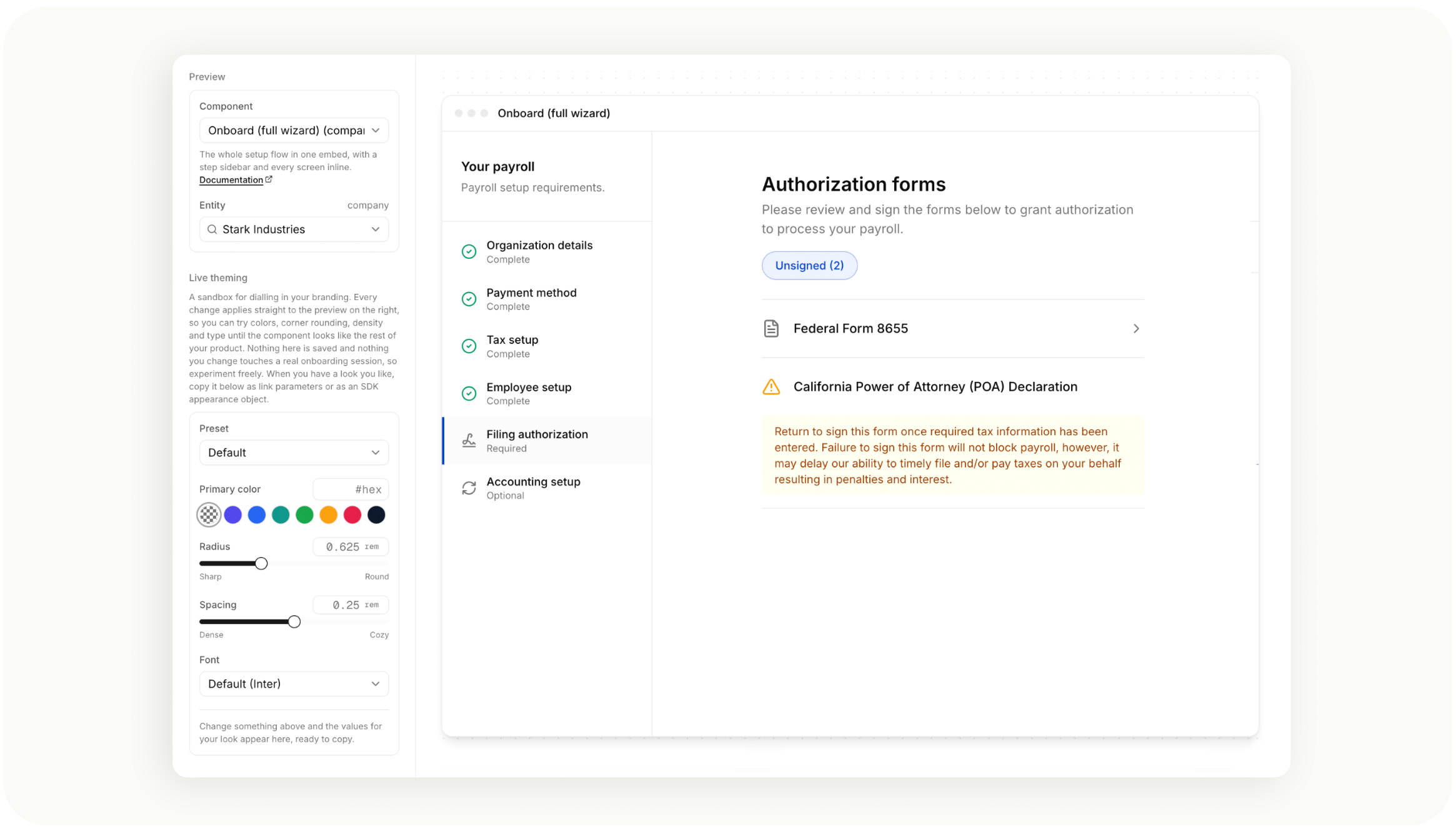
Inside the Explorer you can pick any component, preview it against a real sandbox company or employee, adjust the appearance parameters from this guide live (including the preset themes), and copy the result as link parameters or as an SDK appearance object to paste straight into your integration. Each component links to its reference docs from the picker.
Rollout timeline
V2 is controlled by a single feature flag on your provider account, managed by Check.
- Preview anytime. The Component Explorer is already available in sandbox (see above), so you can see every V2 component and experiment with theming today without changing anything about your integration.
- Sandbox first. Ask your Check contact to enable V2 for your sandbox account. Every link you mint in sandbox then serves the new app. Verify your flows: mint the components you use, click through them, and confirm your event handlers fire. Your existing test suites should pass unchanged.
- Production goes live for everyone on September 1. The change applies to newly minted links; links minted before then keep working where they were minted. If you want production enabled sooner, or you need more time past September 1, reach out to your Check growth manager before then and we will schedule your cutover.
If anything looks wrong after your production cutover, we can flip you back the same day; the change reverses for newly minted links immediately.
Configuration reference
Everything you can configure on a component link, in one place.
Appearance parameters
Append these to the minted URL as query parameters, or pass them through the SDK's appearance options. They apply to every component and to the full Onboard flow, and they all compose. Where a default says "your provider theme," the value comes from the theme configured on your provider account; a link parameter overrides it for that link only.
| Parameter | Values | Default | Notes |
|---|---|---|---|
color_scheme | light, dark, system | light | New in V2. system follows the OS preference live. See the next section. |
primary_color | hex, without # | your provider theme | Buttons, links, accents. Overrides the color configured on your provider account for this link only. Contrast guardrails keep it legible on both schemes. |
font_family | font stack string | Inter | Applied app-wide. |
monospace_font_family | font stack string | system mono | Numeric/code surfaces. |
border_radius | CSS length | neutral default | New in V2 (no legacy equivalent). Corner rounding across inputs, cards, buttons. |
spacing | CSS length | neutral default | Density knob for padding/gaps. |
include_logo | true, false | true | Shows your provider logo where components render one. |
include_close_button | true, false | false | Renders a close control in embedded mode; closing fires check-onboard-app-closed / the component's close event. |
height, width | CSS length | responsive | Constrains the embedded surface; most integrations size the iframe instead. |
Component behavior parameters
Parameters that change what a component shows (jurisdictions, deep links, filters, integration partners) are unchanged in V2 and documented with each component in the component library reference. Whatever your mint requests send today keeps working; nothing in the migration touches them.
Minted links are single-use: opening a link consumes its login code, so mint a fresh link per session rather than reusing or bookmarking one. Everything else on the link's query string is managed by Check and the SDK; treat the returned URL as opaque apart from the parameters documented above.
Controlling light and dark mode (Coming soon!)
New in V2: components can follow your application's color scheme. Pass color_scheme alongside your other appearance parameters when minting a link, or through the SDK's appearance options.
| Value | Behavior |
|---|---|
light | Always light. This is the default; absent or unrecognized values also resolve to light, matching how components render today. |
dark | Always dark. |
system | Follows the user's OS/browser preference (prefers-color-scheme), and updates live if the user changes it. |
POST /companies/{company_id}/components/payment_setup?color_scheme=dark&primary_color=635BFFcolor_scheme composes with your other appearance parameters: primary_color, font_family, monospace_font_family, and border_radius all apply in both schemes, and the component keeps contrast guardrails so your brand color stays legible on either background.
Toggling the scheme at runtime
If your application has its own light/dark toggle, you do not need to remount the component when the user flips it. The SDK handler returned by the embed initializer exposes a setter:
handler.setColorScheme("dark"); // "light" | "dark" | "system"If you embed without the SDK, the equivalent message can be posted into the component iframe directly:
iframe.contentWindow.postMessage(
  { name: "check-component-set-color-scheme", data: { scheme: "dark" } },
  componentOrigin,
);
scheme accepts the same three values as the mint parameter. Switching to system starts following the OS preference live; switching away stops following it. Invalid values are ignored. The component only honors messages from the embedding page's own origin, so scheme changes cannot be injected by third parties.
Pattern guidance: if your app has its own toggle, mint withlightordarkmatching your current state and drive changes through the runtime message. Usesystemonly when your app itself follows the OS preference.
Known differences
We track every intentional deviation from the old behavior. The ones that could matter to an integration:
- Deprecated component types.
pre_approval,submit_for_setup,previous_payroll_integration, andearly_enrollmentare not served by V2. These have had effectively zero usage; if you believe you mint any of them, tell your Check contact before enabling the flag. - Dead-end steps removed. The old Onboard flow could show setup steps that led nowhere when the underlying feature was disabled for your account. V2 only shows steps it can actually serve.
Verifying your integration
A suggested checklist for the sandbox pass:
- Mint and open every component type you use in production.
- Confirm your
check-component-*-complete(and, for Onboard,check-onboard-app-completed) handlers fire at the same points. - If you embed in an iframe, confirm the iframe unhides on
check-component-app-loadedas it does today. - If you pass appearance parameters, confirm your branding renders, then try
color_scheme=darkeven if you do not plan to use it; it is the fastest way to spot any custom CSS assumptions in your embedding page. - If identity verification is enabled for your account, run the filing authorization flow through the Persona webcam step. This works in V2 exactly as in V1, including the SDK delegating camera access into the iframe automatically; the only setup that ever needs attention is a hand-built iframe, which requires
allow="camera; microphone"in both generations. - Run whatever automated coverage you have against sandbox.
If anything behaves differently from the old components and it is not listed above, that is a bug we want to hear about. Send your Check contact the link, the component, and what you expected; minted links encode everything we need to reproduce.
Updated 2 days ago